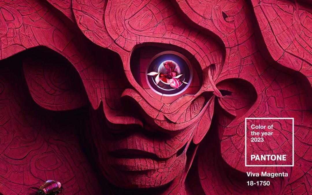
Pantone has announced their much-anticipated Colour of the Year for 2023—what is it? This year it’s…Viva Magenta! And here’s how it looks:
Pantone’s 2023 colour, Viva Magenta 18-1750 is a bold choice for 2023. It inexplicably strikes a balance between warm and cool. Pantone describes Viva Magenta as ‘a shade rooted in nature descending from the red family and expressive of a new signal of strength.’
Pantone appears to be referencing recent cultural and political times and events with the announcement of its 2023 colour—indicating that Viva Magenta symbolises a new beginning of sorts. Pantone says, ‘Viva Magenta is brave and fearless, and a pulsating colour whose exuberance promotes a joyous and optimistic celebration, writing a new narrative’.
The brand described it on Twitter as, ‘An unconventional shade for an unconventional time’. Additionally, Pantone says the colour, ‘welcomes anyone and everyone with the same verve for life and rebellious spirit. It is a colour that is audacious, full of wit and inclusive of all.’ Other words Pantone uses to describe Viva Magenta include: empowering, electrifying, powerful, and boundaryless.
The team at ATeam Printing agrees that Pantone’s choice for 2023’s Colour of the Year is a strong choice. It’s majestic yet elegant; assertive but welcoming. We can’t wait to create and print designs using Viva Magenta. If you’re looking for printing services in Perth, consider A Team Printing for wide-ranging print services with a team that has over 20 years of experience.
Who is Pantone, and what do they do?
Pantone is a company that was founded in 1962 as a commercial printing company. The company began creating Pantone Guides—a series of colour swatches that could be used by any and all industries when a product enters the production stage. The system was revolutionary because it meant that industries could use the Pantone Guides as references to match colours instead of using adjectives and descriptions when trying to attain the exact tone they had in mind.
The Pantone colour system solved the very complex problem of colour matching in the printing industry. Pantone gave every single colour, and every tone and tint within those colours, numbers to classify them. The company then produced these colours in pocket-sized fan swatches—Pantone quite literally wrote the book on colour matching.
Pantone’s simple way of classifying, communicating, and matching colours very quickly became the best-known and most important colour-matching system in the world. For more than half a century, Pantone has been the go-to colour-matching system for the design world, including paint, dye, ink, plastic, and textile manufacturers.
What is ‘Colour of the Year’?
The Pantone Color Institute introduced the Pantone Colour of the Year in 2000. It was intended to be a trendsetting concept for brands that they could implement in their marketing and branding, as well as a concept that could be used by creative society as a whole. The creation of the Colour of the Year confirmed Pantone as an industry leader in colour matching and indeed for all things colour-related.
Every December, there’s a big buzz around the impending announcement of Pantone’s next Colour of the Year. To generate more excitement this year, the brand posted some images of soda cans as homages to previous years’ Colours of the Year.

How does Pantone decide the Colour of the Year?
Pantone doesn’t simply select the colour on a whim. The colour is decided upon after taking stock of trends and events that take place throughout the previous year. The Pantone Color Institute takes into consideration every aspect of society such as fashion, marketing, consumerism, social media and even politics.
2021’s Colour of the Year was actually two colours: Illuminating (yellow) and Ultimate Grey. Announced in December 2020 at the height of the Coronavirus pandemic, the colour choices were telling of the moment. The (Illuminating) yellow symbolised hope against the Ultimate Grey that had become life under lockdown.
Learn more about A Team’s Digital printing Perth services.
What impact does Colour of the Year have on design?
There really is no understating the tremendous impact that Pantone’s choice for its Colour of the Year has on consumer products. A popularly touted example is the iconic scene in the 2006 film ‘The Devil Wears Prada’. Anne Hathaway’s unfashionable character, Andy, gets a job at a powerhouse fashion magazine, Runway. In the scene, Andy quietly scoffs at two similarly coloured belts that have just been described as ‘so different’.
Andy’s flippant reaction results in Meryl Streep’s character, Miranda Priestly, unleashing an incredibly calm yet unnervingly curt explanation of the power of the fashion industry and its influence on consumer products. She picks Andy’s blue jumper as an example, explaining: ‘It’s not just blue, it’s cerulean, and four years prior, designers Oscar de la Renta and Yves Saint Laurent had both used cerulean in their runway collections. The colour then made its way through other designers’ collections, into department stores, and finally into the average person’s closet.’
What isn’t mentioned in the film is that on the cusp of the millennium, Pantone inaugurated its Colour of the Year range by picking Cerulean. While The Devil Wears Prada is just a film, and Miranda Priestley’s spiel about cerulean is fictional, the concept is actually very real—Pantone’s choice of colour has huge financial impacts.
In 2019, the Colour of the Year was Living Coral. The shade bore a striking resemblance to a particular shade of Apple’s newly released iPhone XR. That colour sold like hotcakes throughout the year, and it’s hard not to attribute at least some of those sales to Pantone. A year later, Pantone’s 2020 colour was selected—Classic Blue. A few months passed before Apple unveiled its colours for the iPhone 12 and iPhone 12 Mini, with a tone of blue that was exactly the same as Pantone’s Colour of the Year.

The trendsetting power of Pantone has impacted consumer industries time and time again. Another huge example is ‘millennial pink’. This became the unofficial name of the shade picked for Colour of the Year in 2016, Rose Quartz. The colour was such a hit across every millennial-helmed and patroned brand and could be found in almost every millennial dwelling.
You could hardly get away from millennial pink in its heyday. It was everywhere: on accent walls in homes, television programmes and movies, furniture, cookware, shoes, and hair. And who can forget Apple’s rose-gold iPhone? The point is that Pantone’s choices for Colour of the Year inevitably find themselves on all sorts of consumer products ranging from rocking chairs to spatulas.
While the unveiling of Pantone’s Colour of the Year is a hotly awaited annual event, the brand can’t take full credit for consumer choices centred around colour. Colour has always been a huge selling point of products. One study found that 85% of people purchase products due to their colour. While saying this, the power that Pantone has over the design industry is probably unrivalled. Its choices for Colour of the Year undoubtedly have an impact on the industries and their consumers, and we’ll likely be seeing Viva Magenta cropping up in brands’ products and marketing for years to come. That is the power of colour and the power of Pantone.
How can I use Viva Magenta?
The extensive colour trending research that goes into selecting the Colour of the Year can save you and your business countless hours of marketing research. The Pantone Color Institute chose the colour because they forecast it as a consumer product and design trend of the year. Basically, it’s created so that it is used by brands and businesses.
Ideas for getting creative with Viva Magenta:
- Create window displays with Viva Magenta banners
- Make business cards in Viva Magenta
- Incorporate Viva Magenta into your calendar
- Send correspondence with Viva Magenta envelopes
If you create a social media-worthy design using Viva Magenta, don’t forget to use the dedicated hashtag #COY2023 to get some extra exposure.
Final thoughts
2023 is the year of Viva Magenta. Get ready to see this colour across the internet, in displays of brick-and-mortar businesses, and on all types of consumer products. Pantone has been setting colour trends for over two decades now, and the influence of its Colour of the Year shows no signs of relenting.
If you wish to incorporate Viva Magenta into your next design—whatever that may be—speak to the team at ATeam Printing Perth. We help our customers on a huge range of projects from large-scale print jobs to single-print tasks. In addition to printing, ATeam Printing also offers graphic design services for our customers that have a vision in mind but need help getting that to paper.