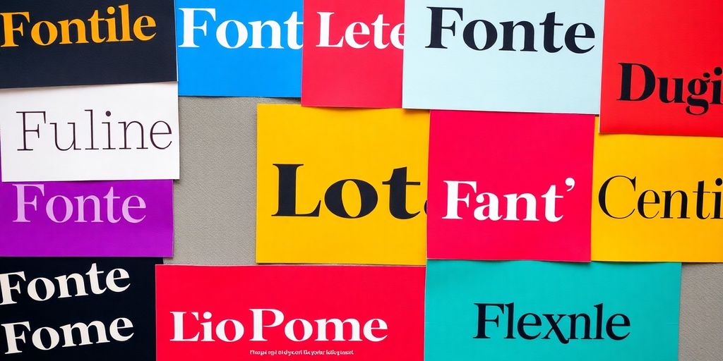
Choosing the right font for your print design can feel like a daunting task. Fonts do more than just fill space; they carry emotions, set the tone, and communicate your brand’s message. This article will guide you through the ins and outs of typography, helping you make informed decisions when selecting fonts that align with your project’s goals. With a bit of understanding about font psychology, readability, and practical tips, you’ll be well on your way to mastering the art of font selection.
Key Takeaways
- Fonts carry emotional weight and can influence how your brand is perceived.
- Readability should always be a priority when selecting fonts for print.
- Testing your chosen font in real-world scenarios helps ensure it meets your needs.
- Pairing fonts effectively can enhance your design and create visual harmony.
- Consider legal aspects of font licencing to avoid potential issues.
Understanding Font Psychology
Typography isn’t just about making words look pretty; it’s deeply intertwined with psychology. The fonts you choose can evoke specific emotions and influence how your message is perceived. Ever wondered why some brands feel trustworthy while others seem playful? A big part of that comes down to their font choices.
The Emotional Impact of Fonts
Fonts have personalities. Some are serious and professional, while others are fun and quirky. Think about it: a delicate script font might feel elegant and feminine, while a bold, sans-serif font can project strength and confidence. The key is to understand the emotional associations different font styles carry. Consider how the visual weight, shape, and overall style of a font can subtly alter the reader’s mood and perception.
How Fonts Influence Brand Perception
Your brand’s font is a visual cue that communicates your values and personality. A consistent font choice across all your materials helps build brand recognition and reinforces your brand’s identity. For example, a tech company might use a clean, modern sans-serif font to convey innovation and simplicity, while a luxury brand might opt for a classic serif font to project sophistication and heritage. It’s about creating a cohesive visual language that aligns with your brand’s overall message.
Choosing Fonts That Align with Your Message
Selecting the right font involves more than just picking one you like. It’s about understanding your target audience, the message you want to convey, and the overall tone of your brand. Ask yourself: What emotions do I want to evoke? What kind of impression do I want to make? Consider the context in which the font will be used – is it for a website, a brochure, or a logo? By carefully considering these factors, you can choose fonts that not only look good but also effectively communicate your message and strengthen your brand identity.
Choosing the right font is like choosing the right outfit for an occasion. It needs to be appropriate, comfortable, and reflective of your personality. Don’t just grab the first font you see; take the time to explore different options and find the ones that truly resonate with your brand and your message.
The Importance of Readability in Print Design
Readability is paramount in print design. If your audience can’t easily read your message, the most beautiful design is useless. It’s about making the text accessible and comfortable to read, ensuring the message is conveyed effectively. What makes a font readable? How do you test if a font is readable? What are the common mistakes to avoid?
Factors Affecting Readability
Several factors influence how readable a font is. These include:
- Font Size: Too small, and people will strain their eyes; too large, and it becomes overwhelming.
- Line Height (Leading): The space between lines of text. Insufficient leading makes the text feel cramped, while too much creates a disconnected feel.
- Letter Spacing (Tracking): The space between letters. Tight tracking can make words blur together, while excessive tracking can make the text feel disjointed.
- Font Style: Bold, italics, and other styles can enhance or detract from readability if overused. Use them sparingly for emphasis.
- Contrast: The difference between the text colour and the background colour. Low contrast makes the text difficult to see.
Testing Font Readability
Before committing to a font, it’s crucial to test its readability. Here’s how:
- Print Samples: Print out samples of your text in the intended font, size, and layout. This gives you a real-world view of how it will appear.
- Get Feedback: Ask others to read the samples and provide feedback on readability. Fresh eyes can spot issues you might miss.
- Test Different Conditions: View the samples in various lighting conditions to see how the font performs.
Consider the target audience when testing. A font that’s readable for younger eyes might not be as suitable for older readers. Adjust your font choices based on the demographic you’re trying to reach.
Common Readability Pitfalls to Avoid
Several common mistakes can undermine readability in typography in print:
- Using Too Many Fonts: Sticking to a limited number of fonts (ideally two or three) creates a cleaner, more cohesive look.
- Ignoring Line Length: Long lines of text can be tiring to read. Aim for a comfortable line length of around 50-75 characters.
- Poor Kerning: Kerning is the adjustment of space between individual letters. Inconsistent kerning can make words look awkward and difficult to read.
- Insufficient Contrast: Ensure there’s enough contrast between the text and background. Light grey text on a white background, for example, is a readability nightmare.
By paying attention to these factors and avoiding common pitfalls, you can ensure your print design tips result in clear, accessible, and engaging content.
Guidelines for Choosing Fonts
Visual Criteria for Font Selection
When choosing fonts, it’s easy to get lost in what looks ‘cool’. But the best approach is to think about your brand and message first. Your font should visually represent what your brand stands for.
- Consider the overall aesthetic: Is it modern, classic, playful, or serious?
- Think about your target audience: What fonts will appeal to them?
- Don’t be afraid to experiment, but always keep your brand identity in mind.
Technical Considerations for Usability
Beyond looks, fonts need to work well. A beautiful font that’s hard to read is useless. Here’s what to keep in mind:
- Readability: Is the font easy to read in various sizes and formats?
- Scalability: Does the font look good on different devices and screen resolutions?
- File size: Large font files can slow down your website or increase print costs.
Legal Aspects of Font Licencing
Fonts aren’t free for all uses. You need to understand the licencing terms before using a font in your projects. It can get tricky, but here’s the gist:
- Commercial vs. Personal Use: Most fonts have different licences for commercial and personal projects.
- Number of Users: Some licences limit the number of users who can use the font.
- Embedding: If you’re embedding the font in a website or app, you’ll need a licence that allows it.
Always read the fine print! Font licences can be complex, and violating them can lead to legal trouble.
When it comes to serif vs sans serif for business printing, it’s important to consider the context. Serif fonts often convey a sense of tradition and authority, making them suitable for formal documents and established brands. Sans serif fonts, on the other hand, tend to project a more modern and approachable image, which can be ideal for contemporary businesses and digital applications.
Effective Font Pairing Techniques
Choosing fonts isn’t just about picking ones you like; it’s about how they work together. Think of it like putting together an outfit – some colours and styles just clash. The same goes for fonts. Using the right combinations can elevate your design, while poor choices can make it look amateurish and hard to read. So, how do you find fonts that play nicely together?
Identifying Complementary Fonts
The key to successful font pairing is finding fonts that offer contrast yet maintain harmony. This might sound tricky, but there are a few approaches you can take.
- Serif and Sans-serif: This is a classic pairing. A serif font (like Times New Roman or Garamond) for headings paired with a sans-serif font (like Arial or Helvetica) for body text is a safe bet. The serif font adds a touch of formality and tradition, while the sans-serif keeps the body text clean and readable.
- Font Families: Some font families come with both serif and sans-serif versions. These are designed to work together, taking the guesswork out of pairing. For example, you might use Open Sans for body text and Open Sans Bold for headings.
- Contrast in Weight and Size: Even within the same font family, you can create contrast by using different weights (light, regular, bold) and sizes. A large, bold heading in one weight paired with a smaller, lighter body text can be very effective.
Examples of Successful Font Pairings
Let’s look at some examples of font pairings that work well in print design:
- Oswald (Heading) & Montserrat (Body): Oswald is a sans-serif font with a slightly condensed style, making it great for headlines. Montserrat is a clean, modern sans-serif that works well for body text.
- Playfair Display (Heading) & Raleway (Body): Playfair Display is an elegant serif font that adds a touch of sophistication to headings. Raleway is a versatile sans-serif that complements Playfair Display without overpowering it.
- Roboto Slab (Heading) & Roboto (Body): Roboto Slab is a slab serif font that provides a strong, modern feel for headings. Roboto, its sans-serif counterpart, ensures readability for body text.
Avoiding Common Pairing Mistakes
Font pairing can be tricky, and it’s easy to make mistakes that detract from your design. Here are some common pitfalls to avoid:
- Too Many Fonts: As a general rule, stick to two fonts per design. Using too many fonts can make your design look cluttered and confusing.
- Fonts That Are Too Similar: Pairing fonts that are too similar can create a lack of contrast, making your design look bland and uninspired. You want enough difference to create visual interest, but not so much that the fonts clash.
- Ignoring Font Personality: Every font has a personality. Pairing a playful, whimsical font with a serious, formal font can create a jarring effect. Make sure the fonts you choose reflect the overall tone and message of your design.
When in doubt, keep it simple. A well-chosen font pairing can make a big difference in the overall look and feel of your print design. Experiment, explore different combinations, and don’t be afraid to ask for feedback from other designers.
The Role of Typography in Brand Identity
Typography isn’t just about making words look pretty; it’s a core element of your brand’s identity. The fonts you choose communicate values, personality, and even the kind of customer you’re trying to attract. It’s about the impact of font choice on brand identity. Let’s explore how to make the right choices.
Fonts as a Reflexion of Brand Values
Fonts have personalities. A sleek, sans-serif font might suggest modernity and innovation, while a classic serif font can evoke tradition and trustworthiness. Your font choices should directly reflect what your brand stands for. Think about it: a playful, rounded font might be perfect for a children’s brand, but it would feel completely out of place for a high-end financial institution. It’s about creating a cohesive message that resonates with your audience.
Case Studies of Successful Typography
Consider some well-known brands. Coca-Cola’s Spencerian script is instantly recognisable and evokes a sense of nostalgia and heritage. Conversely, Google’s clean, sans-serif font projects simplicity and accessibility. These aren’t accidental choices; they’re carefully considered decisions that reinforce the brand’s overall message. Analysing these examples can provide valuable insights into how typography can be used to strengthen brand recognition and recall.
Aligning Typography with Target Audience
Who are you trying to reach? A younger audience might respond well to bold, contemporary fonts, while an older demographic might prefer something more traditional and easy to read. It’s about understanding your audience’s preferences and expectations and choosing fonts that appeal to them. Don’t just pick what you like; pick what your customers will connect with.
Choosing the right fonts is like choosing the right clothes for a job interview. You want to make a good impression and show that you understand the context. Your typography should do the same for your brand.
Here’s a simple breakdown:
- Know your brand: What are your core values?
- Know your audience: What are their preferences?
- Choose fonts that align: Do they match your brand and appeal to your audience?
By carefully considering these factors, you can use typography to create a strong and memorable brand identity.

Practical Tips for Selecting Fonts
Testing Fonts in Real-World Scenarios
When thinking about how to select fonts for flyers and brochures, it’s easy to get caught up in aesthetics on a screen. But the real test comes when you see them in action. Print out samples of your chosen fonts in the sizes you plan to use. Look at them under different lighting conditions. How does that elegant script font hold up when it’s shrunk down for the fine print? Can you still easily read the body text when it’s printed on glossy paper? These are the questions you need to ask.
Consider creating mock-ups of your flyer or brochure with the fonts you’re considering. This will give you a much better sense of how the fonts will look in the final product than simply viewing them in a design programme.
Utilising Font Resources and Tools
There’s a wealth of resources out there to help you choose the right fonts. Don’t feel like you have to go it alone. Here are a few ideas:
- Font pairing websites: These tools can suggest fonts that work well together, saving you time and effort.
- Online font libraries: Explore different typefaces and download free trials to test them out.
- Typography blogs and articles: Stay up-to-date on the latest trends and best practises in font selection.
Experiment with different font combinations and see what works best for your project.
Consulting with Design Professionals
Sometimes, the best thing you can do is ask for help. If you’re feeling overwhelmed or unsure about your font choices, consider consulting with a design professional. They can offer expert advice based on their experience and knowledge of typography. A designer can help you:
- Identify fonts that align with your brand and message.
- Ensure your font choices are accessible and readable.
- Avoid common font selection mistakes.
It might seem like an extra expense, but the investment can pay off in the long run by ensuring your printed materials look professional and effective.
Common Mistakes in Font Selection
It’s easy to slip up when choosing fonts, even for experienced designers. Knowing what not to do is just as important as knowing what to do. Let’s look at some common font selection mistakes and how to avoid them.
Overusing Different Fonts
One of the biggest traps is using too many fonts in a single design. It can make your work look messy and unprofessional. A good rule of thumb is to stick to a maximum of three fonts. Why? Because more than that, and things can get visually confusing really quickly. It’s like having too many cooks in the kitchen – the result is rarely good. Think about it: each font has its own personality, and too many personalities clashing on one page just creates chaos. Instead, focus on using different weights and styles within a single font family to create visual interest without overwhelming the viewer.
Ignoring Brand Consistency
Your font choices should always reflect your brand’s identity. Using a playful, cartoonish font for a serious financial institution, for example, just doesn’t make sense. It creates a disconnect and can damage your brand’s credibility. Brand consistency is key to recognition and trust. Consider these points:
- What are your brand values?
- Who is your target audience?
- What feeling do you want to evoke?
Your font selection should align with these elements. If your brand is modern and innovative, a clean, sans-serif font might be a good choice. If it’s classic and traditional, a serif font could be more appropriate. Always refer to your brand guidelines (if you have them) to ensure consistency across all your materials.
Neglecting Accessibility Considerations
Accessibility is often overlooked, but it’s a crucial aspect of font selection. If people can’t read your text, your message is lost. Here are some things to keep in mind:
- Font size: Make sure your font is large enough to be easily read, especially on smaller screens.
- Contrast: Ensure there’s sufficient contrast between the text and the background. Light grey text on a white background is a no-go.
- Font style: Avoid overly decorative or stylized fonts that can be difficult to decipher. Stick to clear, legible fonts.
Remember, good design is inclusive design. By considering accessibility, you’re ensuring that your message reaches the widest possible audience. Don’t let your font choices exclude anyone.
Choosing the right font can be tricky, and many people make mistakes that can hurt their designs. For example, using too many different fonts or picking ones that are hard to read can confuse your audience. To avoid these common errors, take your time and think about what message you want to send. If you want to learn more about font selection and other design tips, visit our website for helpful resources!
Wrapping It Up
Choosing the right font is more than just picking something that looks nice. It’s about making sure your message gets across clearly and effectively. Fonts can shape how people see your brand, so it’s worth taking the time to get it right. Remember to think about readability, the vibe you want to convey, and how the font fits with your overall design. If you’re feeling stuck, don’t hesitate to reach out to A-team Printing. We’re here to help you find the perfect typeface that matches your project’s needs and goals. Happy font hunting!
Frequently Asked Questions
What is font psychology and why is it important?
Font psychology is about how different fonts can make people feel certain emotions or think in specific ways. Choosing the right font can help your brand communicate its message better.
How can I ensure my fonts are readable?
To make sure your fonts are easy to read, consider their size, spacing, and style. Testing your fonts in real-world situations can help you see if they work well.
What are some common mistakes when choosing fonts?
Some common mistakes include using too many different fonts, not keeping your brand style consistent, and forgetting about accessibility for people with reading difficulties.
How do I pair fonts effectively?
To pair fonts well, look for ones that complement each other. For instance, you might use a bold font for headings and a simpler font for body text to create a nice balance.
What should I consider when selecting fonts for my brand?
Think about what your brand represents and who your audience is. The fonts you choose should reflect your brand’s personality and connect with your target customers.
Are there any legal issues with using certain fonts?
Yes, some fonts require licences for commercial use. Always check the font’s licencing terms before using it in your projects to avoid legal problems.