Having a business card in your wallet or back pocket can be the difference between making or losing potential clients, business partners or investors. They are still a huge part of business transactions and networking, and technology advancements mean that business cards can be simple, creative, unique and quirky.
1. Keep it simple

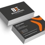
For some businesses and individuals, a simple business card design is best: a name, telephone numbers, email address, address, and perhaps a logo. You may even like to just include a name and one or two contact details – it can be as clean and professional as you like, with a simple one-colour background and standard font.
2. Incorporate a photo

A Team Printing
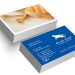
If you work in an industry that has a focus on image or design, incorporating a photo when it comes to your business card design is a great way to show off your business. Business like gyms, hairdressers, photographers, and jewellers often choose to utilise photos.
3. Show off your curves

A Team Printing
If standard business card shapes don’t grab you, or you’re looking for something a little more unique, why not add in some curved corners to make your cards stand out? You can even curve the longer edges of the cards, or choose one or two corners to give your cards an edge.
4. One sided or double sided

Source: Pinterest
Sometimes, the best business cards are one-sided: coloured on both sides, with all the information on one. In other situations, two sides are necessary to convey all the information or to be able to show off what you have to offer. Try out both, and see what works for you!
5. Get logo-happy

Source: Pinterest
There are many different ways to get potential clients to remember your logo. Allow it to stand out on a stark business card, imprint it, or even use it as your background.
6. Add some depth

Source: Pinterest
Want to get really unique with your design? Add some depth to it by imprinting logos or symbols, and rising or imprinting your text.
7. Colour contrasts

Source: Pinterest
Think about colour contrasting when it comes to finalising your design; you can play around with the base colour on both sides, as well as the text colour and logo.
8. Face forward

A Team Printing
We already know that you can use a photo on your business card – so why not make it a photo of yourself? This is particularly popular when it comes to real estate agents and people in service industries. It helps customers put a face to the name!
9. Horizontal or vertical

Source: Pinterest
Traditional business cards are usually vertical, but who says you need to stick with tradition? If you can’t quite make your design fit, or you’re simply looking to stand out when it comes to your business card, think about flipping it on its head.
10. Get experimental

Source: Pinterest
The best part about designing a new business card is that you can play around with materials, colours, styles and concepts. Think about how you want your business or service represented – and make it unique! Contact us to get started today.

